Sao Paulo


Rebranding with the former visual identity as inspiration
For this rebranding, we stayed close to the original graphic identity. The brief was to go for a refined and modernised visual identity, while respecting the existing colours and the familiar icon.
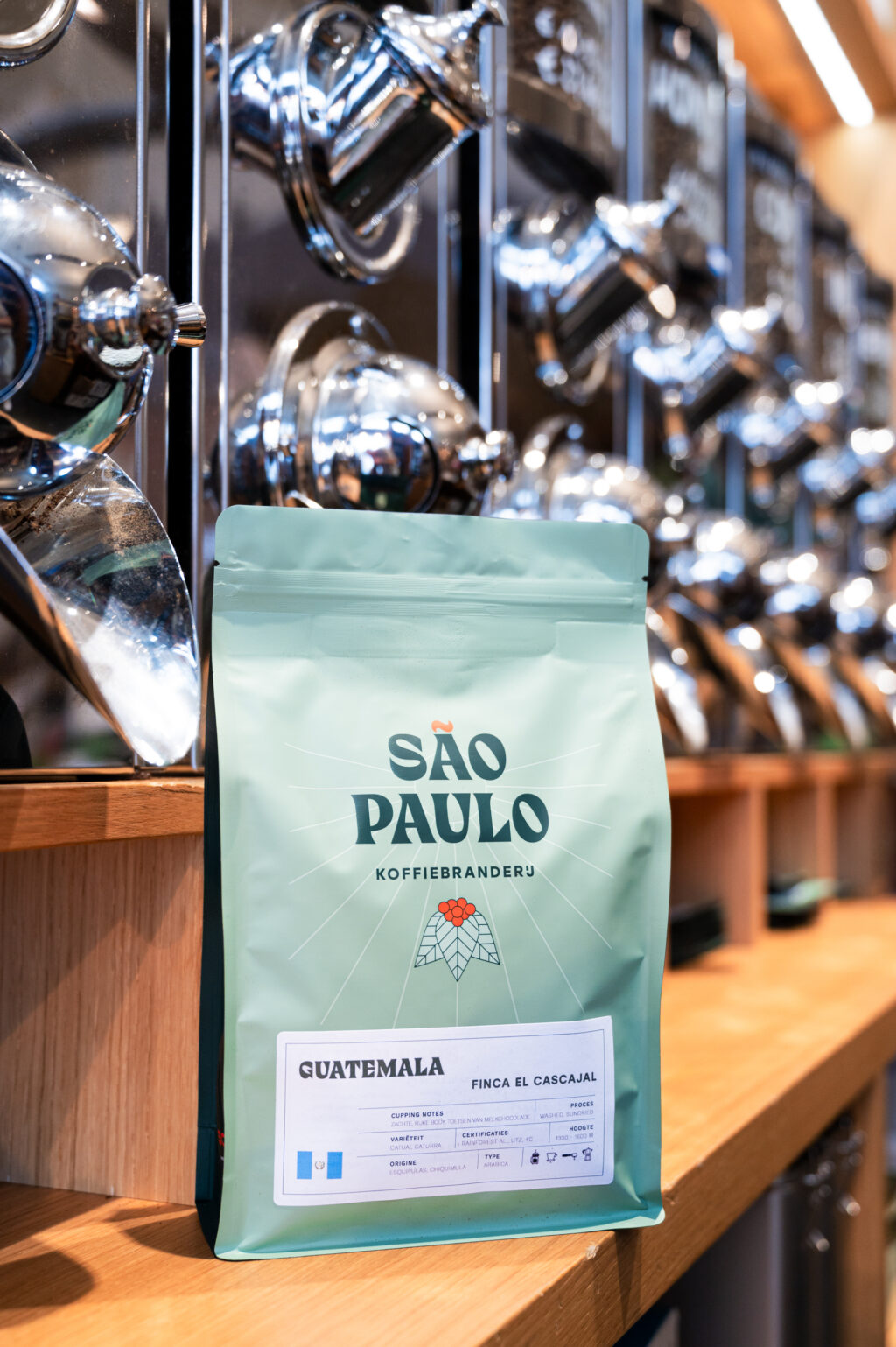
The olive green main colour from the previous branding tends more towards a warm dark green in the new identity, creating a high-end look. In addition, the main colour is now joined by several sub-colours from the same spectrum: two grey-green shades for backgrounds, an almost mint green as an accent colour and, finally, an orange-red for titles.

Refined graphic illustration
The illustration of coffee beans, a São Paulo signature, was carefully redrawn. The lines became tighter and the details more refined, resulting in a fresher and more modern look. The nod to São Paulo, the sun rays, and the initials make the icon strong enough to be used without the logo.
Daring typography
The typeface also comes off as very surprising. For the typography, we chose a bold, bold block letter that immediately stands out. This typeface enhances the visibility and recognisability of the brand, and gives a powerful, self-assured look to all communications.

Packaging design as the primary expression of the visual identity
This rebranding is beautifully reflected in the packaging design. The new packaging is consistent with the refined identity and exudes high quality thanks to its matt coating. The combination with the new logo ensures that both the brand and the product are presented clearly and attractively.


Eye-catching signage: facade signage
A new facade sign was designed immediately attracts the attention of passers-by. The sign is both aesthetically pleasing and functional, with clear and stylish typography in the chosen block font, making it stand out immediately.